There are parts of the projection process I feel very comfortable with. I can look at a player’s recent plate discipline, batted ball mix, and power ratios to arrive at an accurate projection for most of that player’s stat line…
But when it comes to projecting playing time, I feel like I’m throwing darts with a blindfold on. How can I realistically make a determination between 675 PAs and 690 PAs?
Until now, I’ve really just relied upon a player’s recent seasons and used qualitative information about injuries, role on the team, and playing time competitions to come up with an estimate for total plate appearances.
Thankfully, a reader of the site recently commented on a post I wrote about the effect of batting order on runs and RBI, and his question helped me arrive at the much more sound approach for projecting playing time I’m about to share with you. Here’s his question:
Interesting stuff. In your research, I am wondering if you happened to look at Team Runs/Plate Appearances on a per game basis?
That is, if a team scores Y runs in a game, what would you predict their Team PAs to be. Something like Y = Ax + B.
~DMM
That question got the wheels turning in my rapidly deteriorating middle-aged brain… There have to be better ways to think about playing time. And I certainly need to take the team’s overall run scoring into account.
Team Plate Appearances vs. Team Runs
To answer the question, I downloaded the last ten years of MLB team offensive stats from Baseball-Reference.com (click here to see the data).
Then I created a scatter plot in Excel by graphing team runs against team plate appearances.
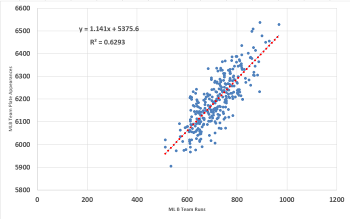
I’ve mentioned it many times on the site already. I’m no statistician. I don’t play one on TV. And I’m not pretending to be one on the internet. I am squarely in the area of having enough knowledge about statistics to offer no help but to only be dangerous. With that amazing qualifier I’ll try to explain what you see in that chart above.
Each of the blue dots represents one team’s season in the last 10 years (2006-2015). For example, the dot in the top right corner is the 2007 Yankees, who scored 968 runs (holy crap, A-ROD!).
The dotted red line represents a trend line or line of best fit. It’s the best estimate of the relationship between team runs scored and team plate appearances. The equation on the graph is the formula used to chart out the red line and is the exact answer to reader DMM’s question (where x is team runs scored and y is team plate appearances).
y=1.141x+5375.6
I suppose that could be helpful at the daily game level too. That equation would become y=0.007x+33.18 if you were trying to project a team’s plate appearances in an individual game (where x is runs per game, not season-long runs).
Projecting Individual Plate Appearances
That answers the original question. But I still wasn’t quite satisfied with stopping there.
Sure, it’s helpful to know that if I think Angels will score 700 runs that I should project that whole team for about 6,175 plate appearances (5,375.6 + 1.141 * 700 = 6,174.3). But what does that mean to Mike Trout if I think he will bat second in the lineup? And what if I think he’ll bat third?
Is there a way to add a third variable to the chart above? So we can see how leadoff hitters on teams scoring 700 runs have fared? Or how cleanup hitters on teams scoring 800 runs have performed?
The Data
Baseball-Reference has a really interesting split table that shows the hitting stats each team had from each spot in the lineup (click here to see Kansas City’s 2015 team split).
I downloaded that split table for all 30 teams for each of the last 10 seasons (300 CSV files!). You can see all the raw data here. Again, thanks to Baseball-Reference for making this data available.
Then I grouped the data by team runs scored, putting teams into categories of 500-549, 550-599, 600-649, 650-699, 700-749, 750-799, 800-849, 850-899, 900-949, and 950-999 runs. Here’s a table showing the number of teams in each of these categories for the AL and NL:
| Runs Scored | AL Teams | NL Teams | Total |
|---|---|---|---|
| 500-549 | 1 | 2 | 3 |
| 550-599 | 2 | 7 | 9 |
| 600-649 | 19 | 34 | 53 |
| 650-699 | 23 | 33 | 56 |
| 700-749 | 33 | 43 | 76 |
| 750-799 | 30 | 25 | 55 |
| 800-849 | 19 | 9 | 28 |
| 850-899 | 12 | 4 | 16 |
| 900-949 | 3 | 0 | 3 |
| 950-999 | 1 | 0 | 1 |
Does Being in the AL or NL Affect PA/G?
To this point I kept AL and NL stats separated. I wanted to see if having a pitcher in the lineup affected the breakdown of plate appearances elsewhere within the batting order. Here’s what I found:

So while having a pitcher in the lineup surely affects a team’s run scoring, you can see by scanning the table above, it doesn’t seem to affect the spread of plate appearances within that lineup. The number of plate appearances per game is nearly identical, regardless of league.
With that in mind, I felt comfortable combining the data so I didn’t have to track NL and AL separately. Here are the stats for all of Major League Baseball:

That’s Great, Can You Put That Data in a Pretty Graph?
In the chart below, each different colored bar represents a different strata of team runs scored. Click the image below for a much larger image.
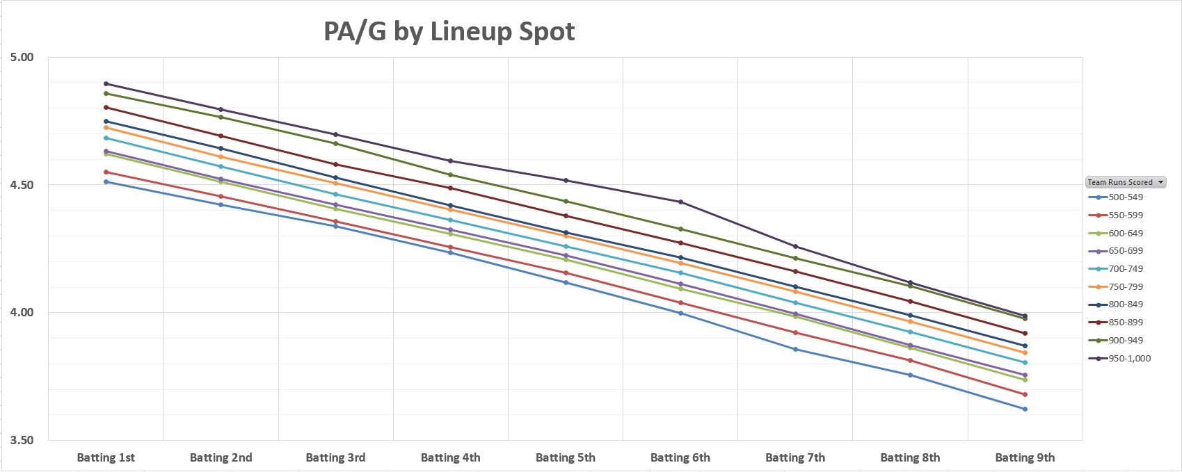
You can see that moving down a spot in the batting lineup costs a player about 0.10 plate appearances per game. Or roughly 16 plate appearances over the course of a 162-game season. That’s consistent with what we saw here.
But now we have another variable we can use. Team runs scored. And it looks like each additional 50 runs a team is projected for means about 0.04 plate appearances per game. Or about 6.5 more over the course of a 162-game season.
What About Total Plate Appearances? Not Per Game
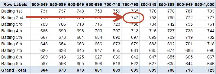
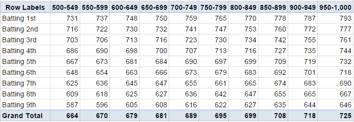
Instead of per/game plate appearances, here are the season totals for plate appearances:
And graphically:
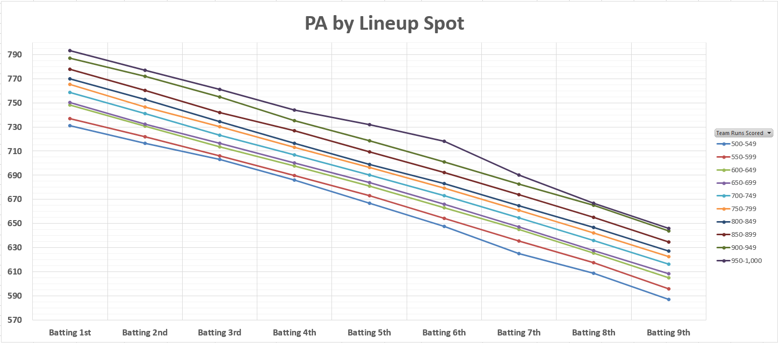
So again, about 16 plate appearances more for each spot a player moves up in the order. And about 5-7 plate appearances for each additional 50 runs scored by the player’s team.
Applying This to a Projection
We can use the information above instead of plucking a plate appearance projection out of thin air. You could simply refer to the season-long plate appearance total chart. For example, a two-hitter on a team you think will score 775 runs might be expected to have around 750 plate appearances.
Does that Really Make Sense?
What if you only expect that same player to play in 150 games, and not 162? How do you adjust accordingly?
Coincidentally, I was recently trading e-mails with Doug “RotoDaddy” Anderson of SoCalledFantasyExperts.com. He mentioned to me that he wished the Projecting X Excel template had a better way of projecting playing time.
I think projecting a number of games is more intuitive than a total number of plate appearances.
This is where I think it may make more sense to stick with the PA/G chart from earlier. Instead of entering a total projection, you could instead use a games played projection and the plate appearances/game table from above.
For example, see you could modify the Projecting X Excel Template to calculate Plate Appearances as games multiplied by PA/G for that team’s projected run total. You wouldn’t need to make any other adjustments and all other calculations in the template can remain exactly as they are.

Following this specific example above, you could then enter 4.61 for the player’s PA/G and the 150 game estimate for a projection of 692 PAs (that’s how you differentiate between a projection of 675 and 690!).
Setting up your calculation this way also makes it a lot easier to respond to injury news or playing time concerns about a player. If we find out in mid-March that a player will miss 4-6 weeks of the season, you can easily approximate that to be about 35 games and your PA/G projection can remain untouched.
Or if you start completing projections now and a team vastly improves its offense during the offseason, you can increase the PA/G projection for players on that team accordingly.
The Take Away
This whole process of breaking plate appearances down into games played and PA/G is consistent with the rest of the Projecting X approach, which takes larger stats, like HR, and breaks them down into more predictable component stats like batted ball mix and HR/FB.
Hopefully this information above helps you to remove some of the uncertainty in playing time projections by taking a more objective and scientific approach.
If you’d like more analysis and fantasy baseball research like this, make sure to follow me on Twitter.
Thanks for reading! Stay smart.


One thought on “How to Project Plate Appearances”
Comments are closed.