In this post I’ll show you how you can take a boring black and white spreadsheet and convert it into a visually meaningful piece of art in less than 10 minutes.
An important factor in being a skilled drafter is the ability to remain cool and calm in pressure situations. There may also be opportunities to intimidate some of your opponents during the draft, to give them the impression that you are highly prepared and ultimately familiar with the player pool and your own drafting strategy.
Nothing can accomplish these things better than a fancy color-coded spreadsheet.
There may be an element of hyperbole in that statement. But we have all been there. It’s late in the draft, you’ve already wasted 60 of your 90 second allotted time and you’ve just made the decision that you need to draft a second basemen with some power but that won’t kill you in batting average. Or you need a pitcher with good strikeout totals that won’t kill you in WHIP. Or some obscure shortstop is thrown out for bid in the auction and you can’t remember if he will help you with reaching your target goal in stolen bases.
Enter Conditional Formatting in Excel
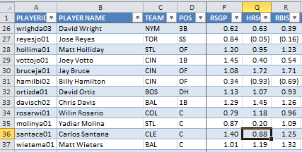
Conditional Formatting in Excel allows you to give visual meaning to a mass of boring looking numbers that can be hard to interpret all at once. Let’s face it, while looking at the spreadsheet example in the image below it is not easy to quickly make sense of the numbers.

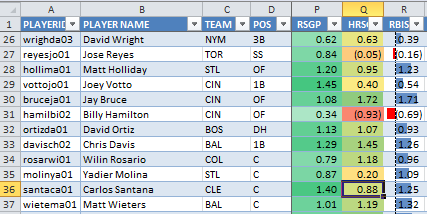
But if I take this same area and apply a few of the different conditional formatting rules to it, you can much more quickly make sense of what you are seeing:

In the “RSGP” column I have applied a rule in which you select two colors. One color represents the highest value in the data selected and the other color represents the lowest value in the data selected. I chose a standard green color for the highest value and white for the lowest. Excel then automatically provides shades between white and green to each player’s “RSGP” based upon its value relative to all the other players in the list. Whether you agree with me or not, I’m down on Billy Hamilton’s ability to stick at lead off for the entire year, and his run projection is the lowest of anyone captured in the screenshot. So he’s the closest to white. While Votto has the highest “RSGP” in this small group of players, so he’s shaded closest to green.
The “HRSGP” column has a rule using three colors. Green is still used for the values that are greatest in this column. Red is used for the lowest values, And Yellow is used for values near the 50th percentile of the group. Again, Excel automatically shades ever player’s value according to this set of instructions. You simply select the three colors and Excel does the rest. Here you can see Billy Hamilton is projected to be very low in “HRSGP”, while Jay Bruce and Chris Davis are much higher. These two illustrate an important concept too. I have Bruce projected to hit fewer home runs than Chris Davis, but Bruce comes out with a higher “HRSGP” based upon the positional replacement level adjustment under the SGP method.
The “RBISGP” is using data bars to depict the value of each player’s RBI compared to the group. Not to keep piling on Billy Hamilton’s lack of hitting prowess, but you see he has a red bar pointing to the left, in his “RBISGP” column. This indicates the magnitude to which his RBI projections are below 0.00 SGP. Jay Bruce, right above him, has a very strong RBI projection and a blue shaded bar depicts this.

This Seems Way Too Complicated
It’s really not. You can add this to your draft spreadsheet in under 10 minutes.
Things To Consider Before We Start
In the step-by-step instructions below, I apply conditional formatting to a player’s standings gain point (SGP) figure for each individual category (e.g. HR, BA, R, etc). I choose to do this because after following the “Create Your Own Fantasy Baseball Rankings” approach, the final SGP figure for any player includes an adjustment for replacement level at the position. This means that 15 HR from a 2B are valued more than 15 HR from a 1B.
The other benefit of applying the formatting to the SGP columns is that rate states like BA, ERA, and WHIP will be weighted appropriately. An OF that might hit .300 but only get 200 PAs isn’t really helpful to our team BA.
There is an argument to be made that you would want to apply conditional formatting to a player’s raw statistics instead of the SGP figure. After all, if you’re trying to draft players in order to reach a targeted goal (like 250 HR), you might be more interested in a 1B projected to hit 18 than the C projected for 17, even though those 17 from the C are more “valuable”.
Anyways, that’s beyond the scope of this post. I’m just here to add fancy colors to your spreadsheet right now. Just know that you can do this using a player’s raw projections even if you haven’t worked through the “Create Your Own Fantasy Baseball Rankings” series.
Step-By-Step Instructions
Continue reading “Taking Your Draft Spreadsheet To The Next Level”
